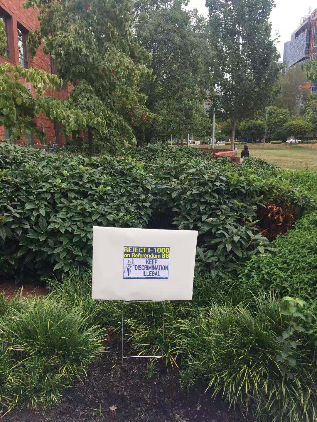
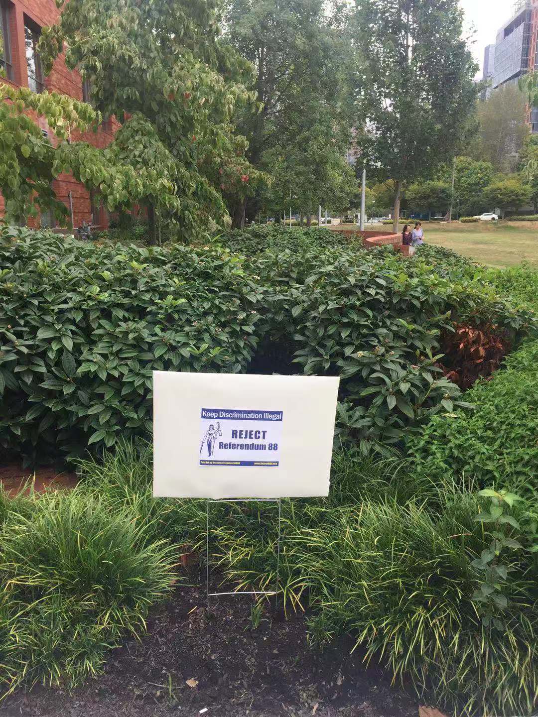
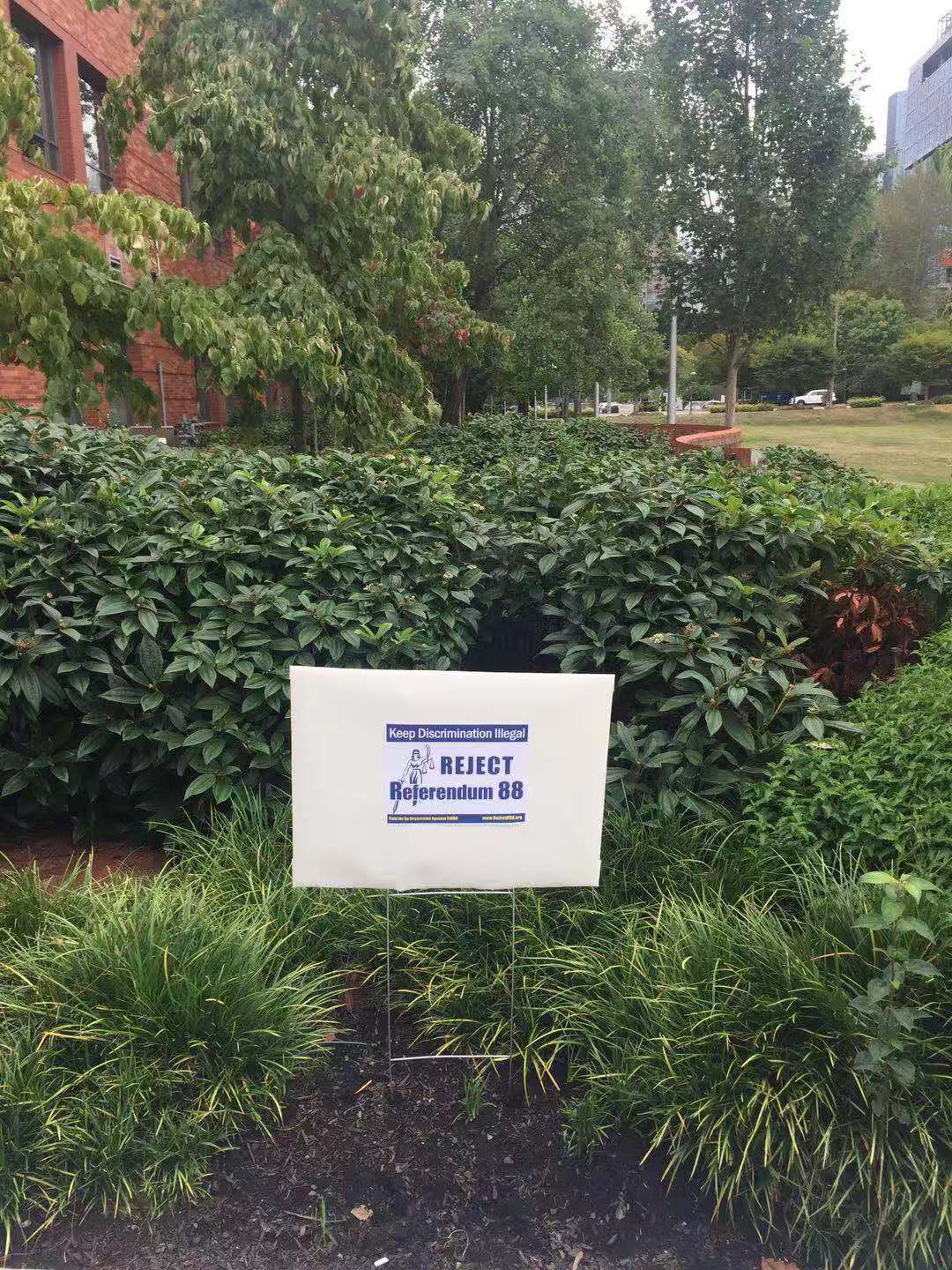
Hi friends, we are looking for your help to provide your thoughts and experience on these design candidates for the sign. We will put these signs out on the street.
All the choices have same cost of printing.
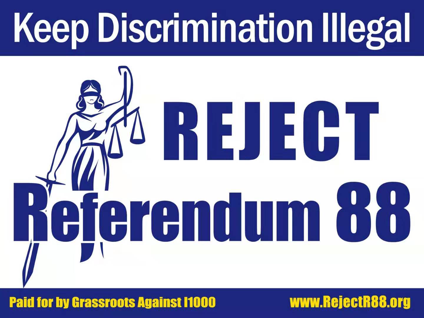
Side A:
Choice A1:
Design logic behind:
Key message is to Reject, which is the largest font in the middle. While driving, most time people can only see one message. If they are interested, they can go to do their research by going to website or google it.
Reason not having I-1000 is that on the back of the sign there will be I-1000.
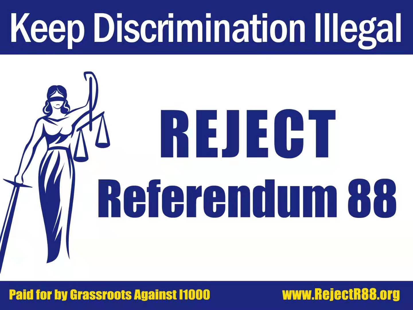
Choice A2:
Design logic behind:
Key message is to Reject, which is the largest font in the middle. While driving, most time people can only see one message. If they are interested, they can go to do their research by going to website or google it.
Reason not having I-1000 is that on the back of the sign there will be I-1000.
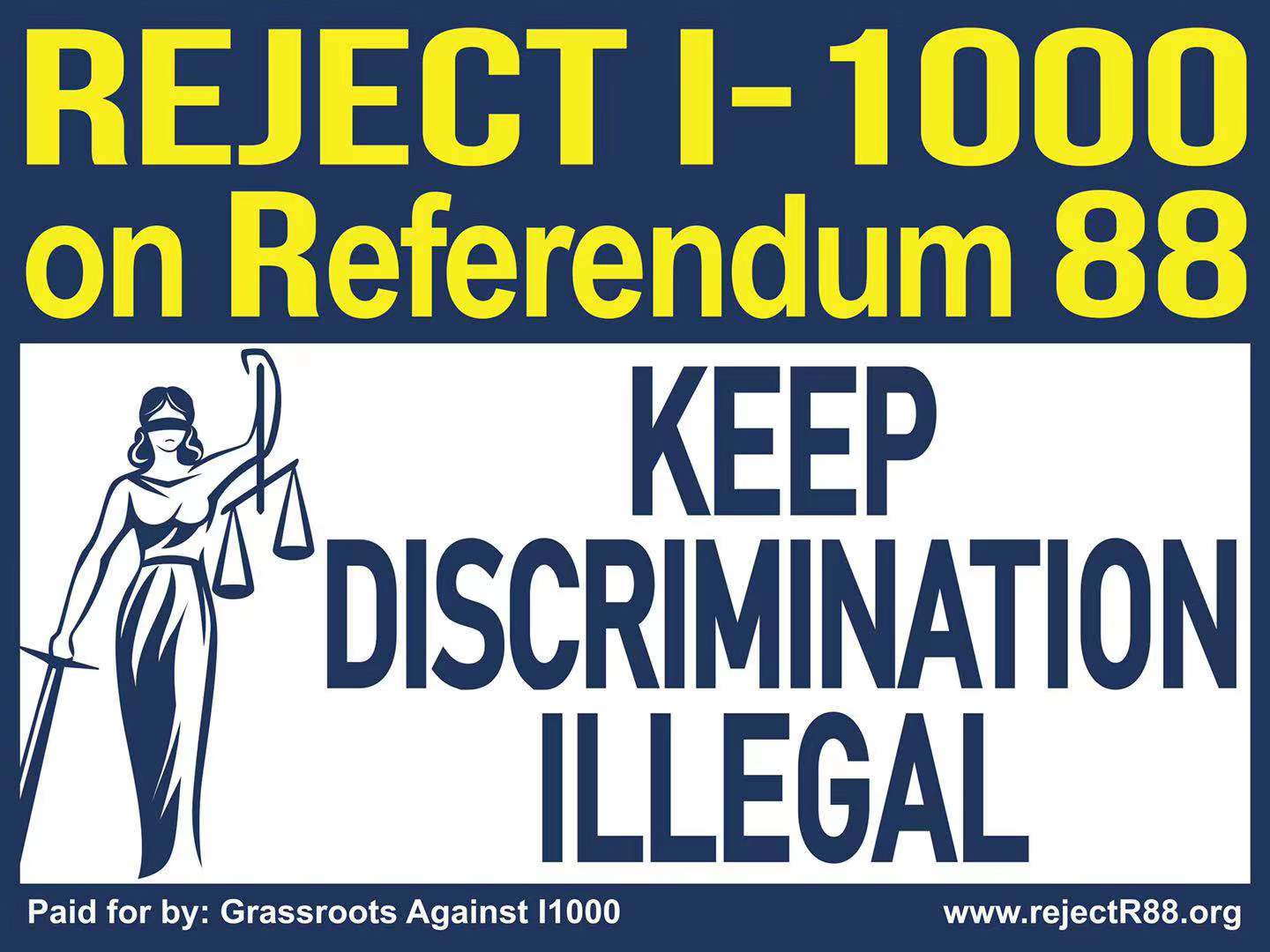
Choice A3:
Design logic behind:
1. why need to keep both I-1000 and R88 ? Since it is very confusing to voters on ballot, even though the title is referendum 88, what voters are actually voting for is I-1000 content. We will have to say “Reject I-1000 on R88” for the clarity.
2. Other design tips from experienced campaign politician consulted : emphasize reason to reject and “reject” word itself ,use condensed font so “keep discrimination Illegal “ can be fit next to Lady logo. Use yellow font on banner with dark blue background to be more popping .
3. considering rainy days in October Seattle, we chose to use large fonts and popping yellow font color.